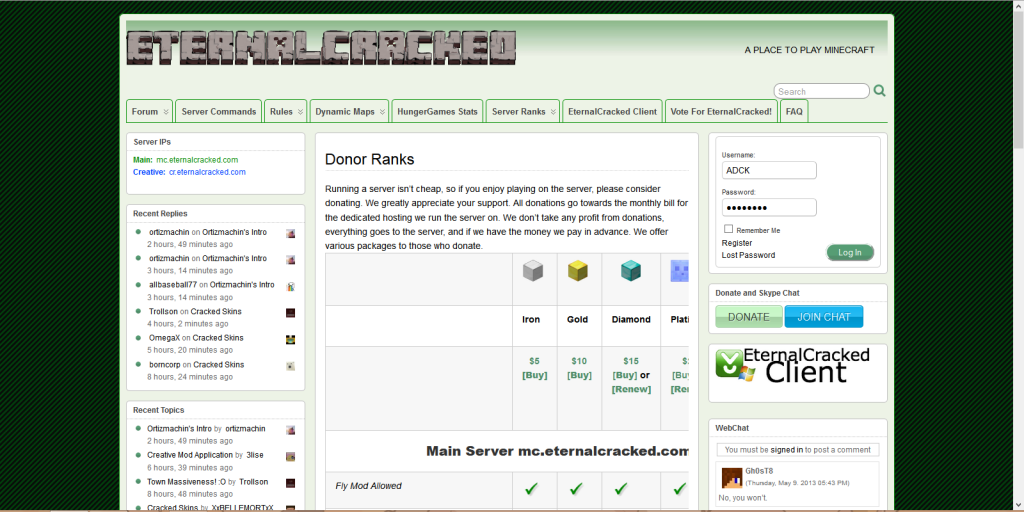
This is a screenshot of the Donor page from the PC at my work, taken on Firefox on 1600×900 resolution, I get the same bug on my home PC on different setup, suggesting it effects most setups.

As can bee seen on the screenshot, Platinum Rank is cut in half, and if there are any ranks beyond platinum, I can’t see them, can’t scroll left/right either.
It is likely caused by the line ‘/hat (Replaces Head with Selected Block)’ as it has no line-breaks in it which causes that column to become that width, pushing all the columns on the right further to the right. The /workbench line would also need to be fixed.
![]() ADCKnight 11 years, 5 months ago.
ADCKnight 11 years, 5 months ago.
Sorry, the comment form is closed at this time.